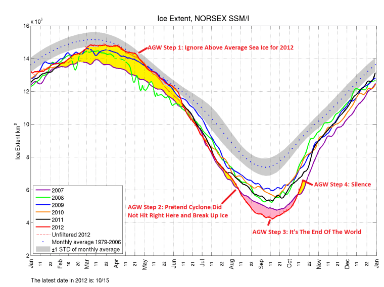
AGW Arctic Sea Ice Propaganda in 4 Easy Steps with an added bonus.
The Yellow is the amount of ice where 2012 was higher than 2007.
The Pink is the amount of ice where 2007 was higher than 2012.
One of those areas is an indicator of the end of the world according to AGW. The other area is to be ignored.

Two comments on the chart — It might be better to examine the area between the 2012 curve and the 1979-2006 monthly average curve. 2007 was a bit of an outlier. In addition, differences from normal when the sun is up, in the Arctic summer, are much more significant than differences from normal during the Arctic winter, since open water captures far more energy from the sun than white ice does.
1) I did a post on how 2012 for weeks sat near 98% of the 1980s average. NSIDC et al never showed the slightest bit of interest in maximum ice doing so well.
https://sunshinehours.wordpress.com/2012/08/28/arctic-ice-2012-a-little-perspective/
2) I had some do a “guest post” on albedo”. Antarctic Ice is much closer to the equator than arctic ice. The suns angle is quite different.
https://sunshinehours.wordpress.com/2012/09/30/impact-of-more-antarctic-sea-ice/
There was a lot of fuss when I showed this graph from the UK Met Office, which suggested Arctic Sea Ice was not declining. Many warmists jumped up and down and asked if I was denying the minimum set in August.
They all missed the point that the chart was of monthly anomalies throughout the year. Apart from a few weeks in the summer, the extent this year has been lower than usual.
And the graph? The Met have “disappeared” it, as it does not support their agenda.
http://notalotofpeopleknowthat.wordpress.com/2012/09/04/the-mystery-of-the-disappearing-graph/
Met reply – Wow! Look at all the awesome colors, but the fabulous hot pink is our favorite..