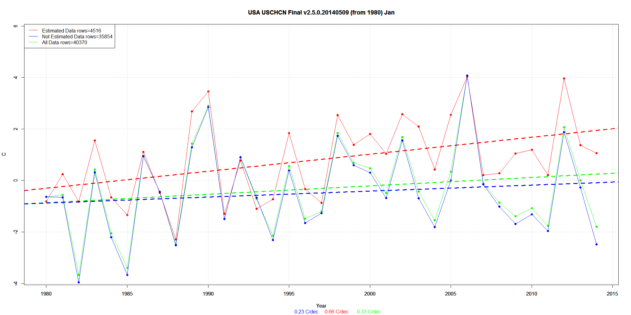
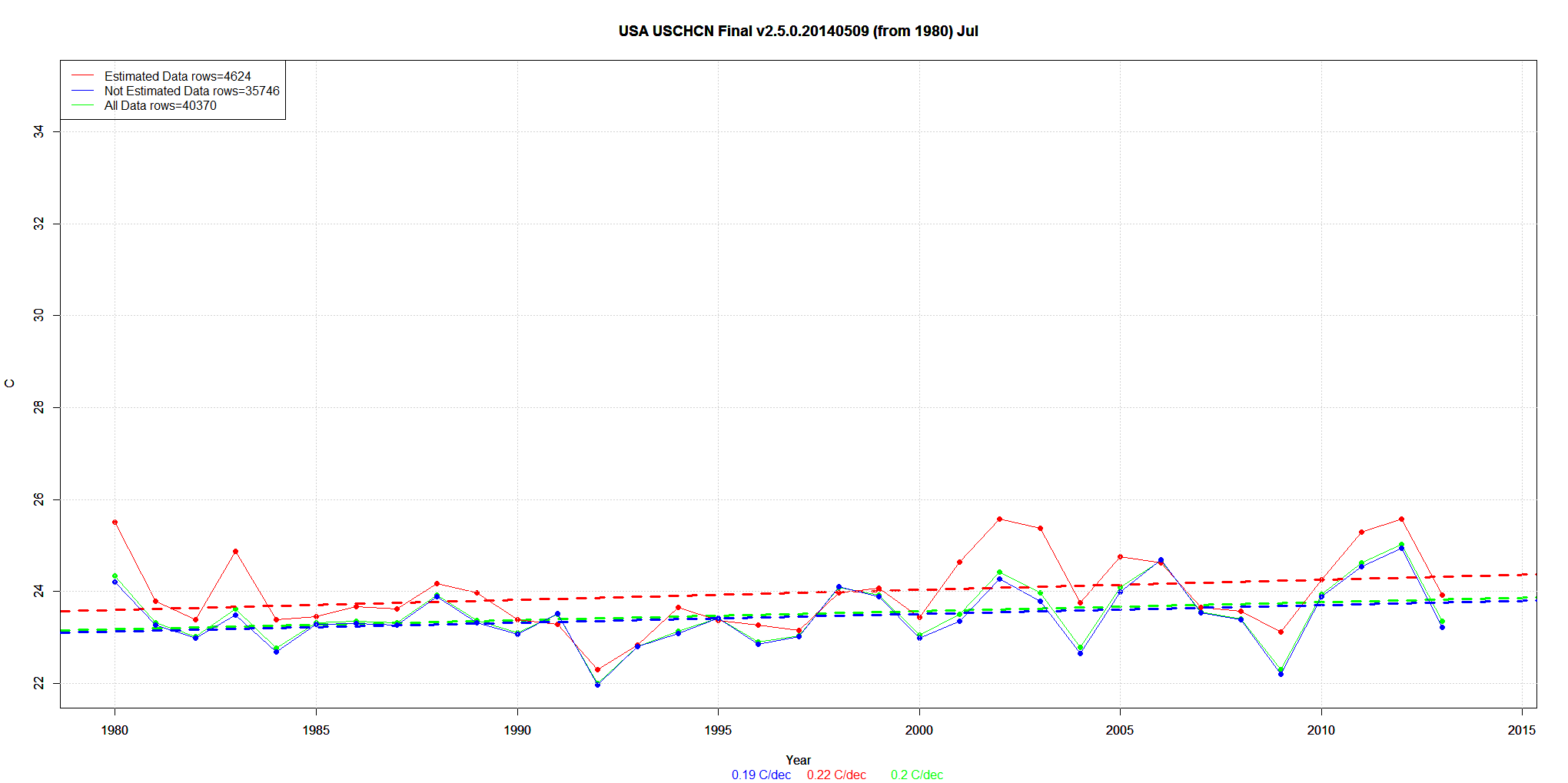
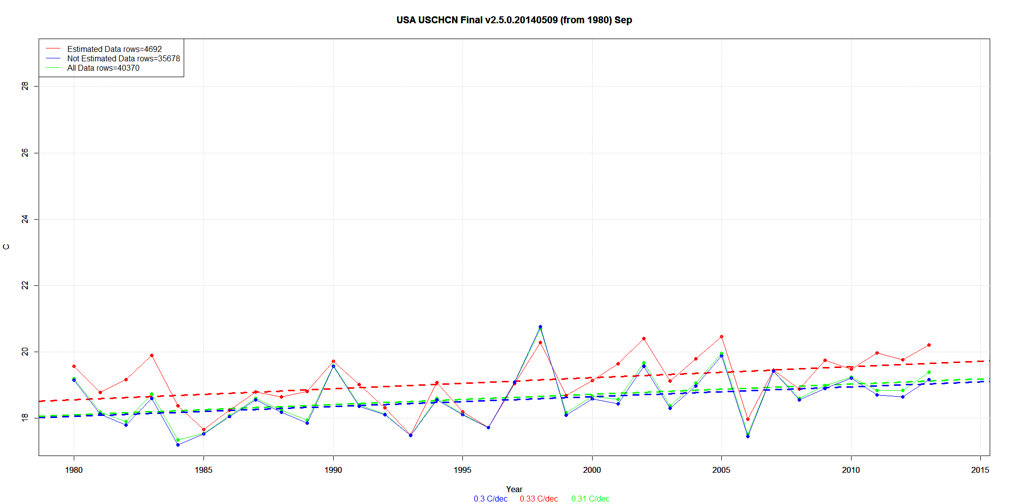
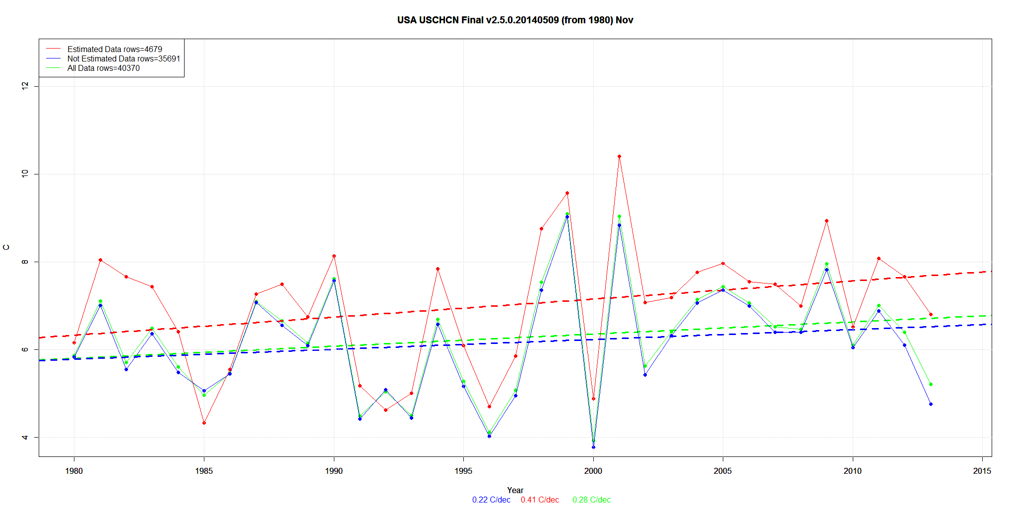
I’ve been posting on USHCN and the effect of “estimating” or “Infilling” on the Final data. I did Arizona earlier.
I repeat … this is the Final data after all the other adjustments. About 15% of the data is Estimated from neighboring stations.
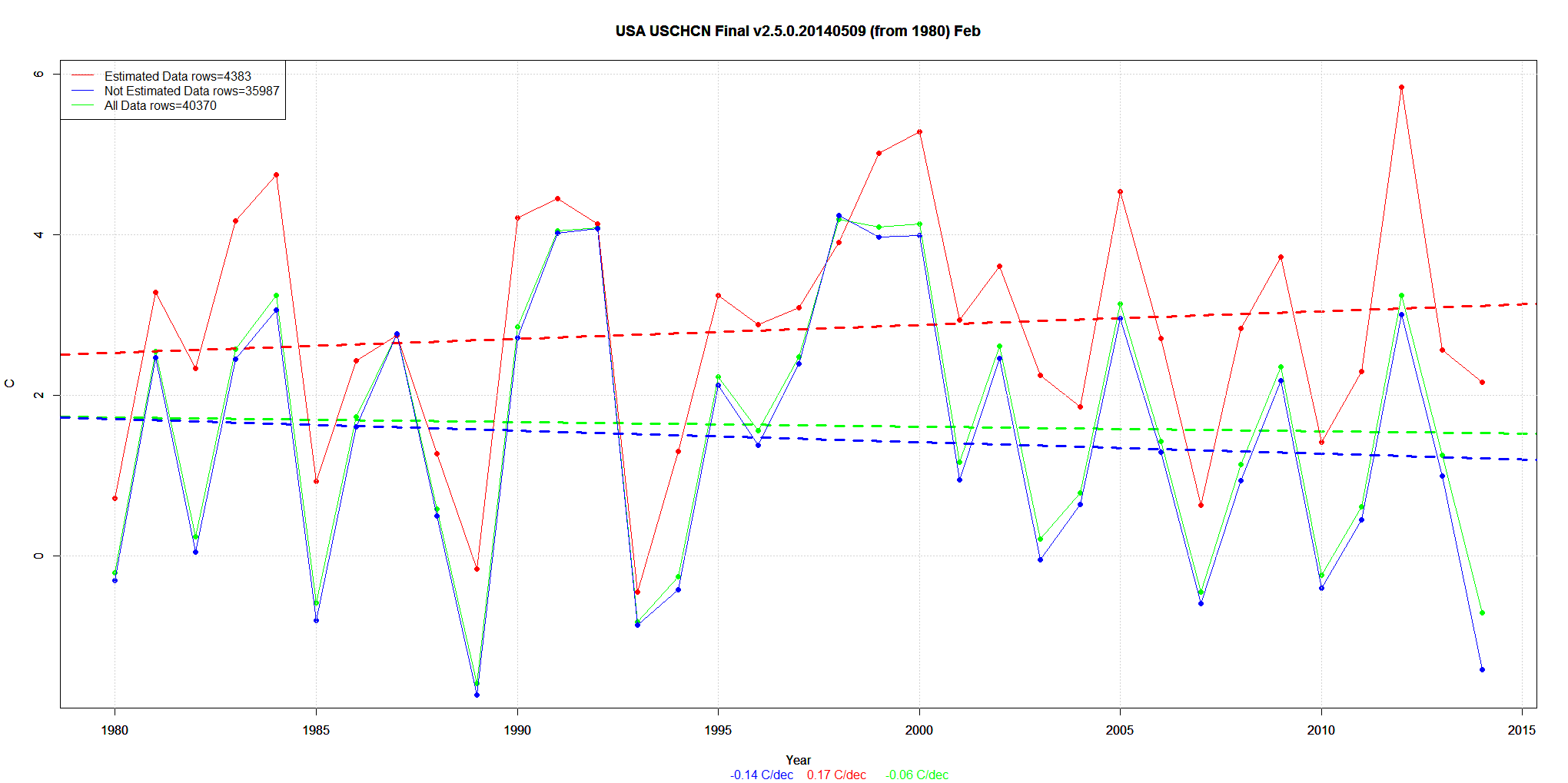
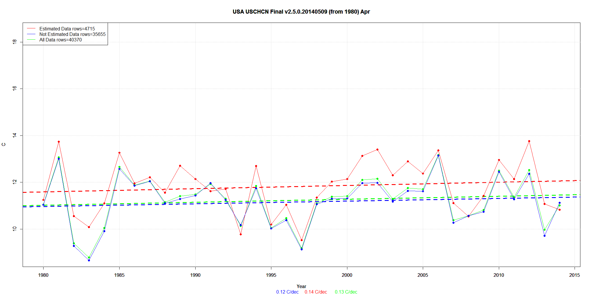
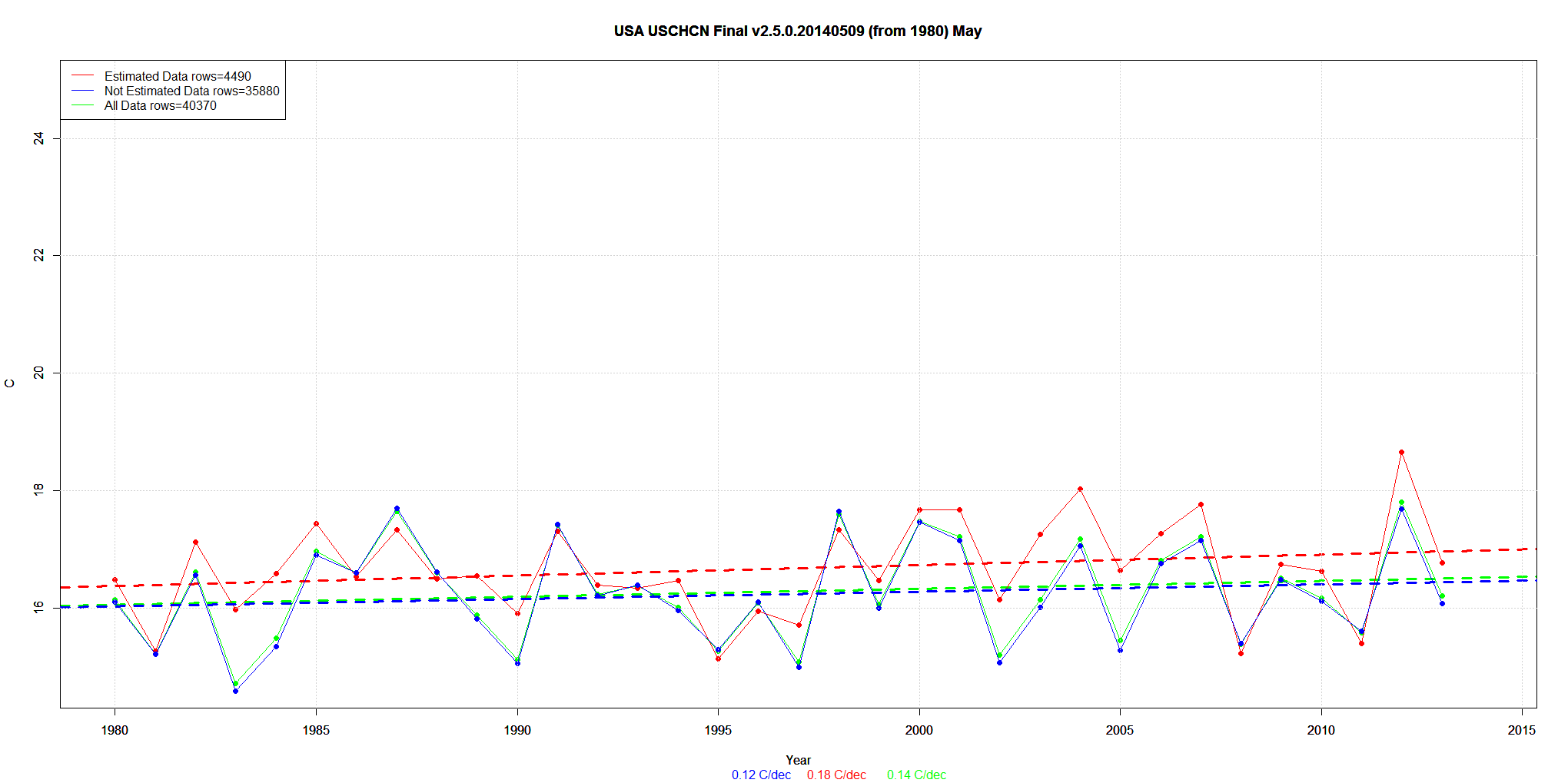
I will post all the monthly graphs … but just discuss the first – January.
The data is 1980 to 2014. So it has the 1980-1990 warming trend in it.
The trend of REAL data is 0.23C/decade. That’s the 35,854 values referenced in the legend.
Then they add in about 15% Estimated data with a trend of +0.66C/decade. That’s the 4516 values.
The net result is a new trend of +0.33C/decade.
Presto. Magic. A .23C trend is now a .33C trend. (Click on graphs for larger).


Great work! Maybe graphs a bit smaller and could you perhaps try Goddard’s Before and after on the same graph, that’s the real killer.If ALL the graphs were done that way it would be unassailable for future proof.Cheers and thanks for your work