Yesterday I did a post looking at every station and finding out which year had the hottest July. Today I am showing you what effect the adjustments have.
I am using USHCN Final Tmax monthly data and comparing it to the raw data . From the file v2.5.0.20140627. (This is not necessarily all the data NOAA uses)
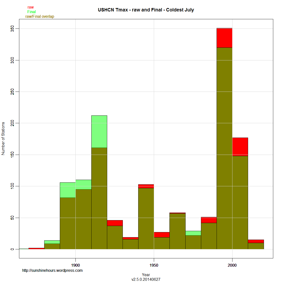
The format is a little different, but it is designed to allow easy comparison. Red is the raw data. Green is Final and muddy green is where raw and final overlap.
As you can see, the number of years near the present have a lot green. Which means the adjustments created more record hot years.
The 1910s to 1980s have red at the top which indicates raw data. Translation: More record July’s occurred in the past using raw data.
For the Coldest July data, the results are the opposite. Adjusting creates more colder July’s in the past and takes away cold July’s from the present.


This is much more revealing than the usual GMT analyses. You can see the bias in the adjustments, but they are not enough to erase the fact that July was hotter in the past and is cooler in the present.
Here are some thoughts on this whole issue
I have always been uncomfortable with the adjusting, anomalizing and homogenizing of land surface temperature readings in order to get global mean temperatures and trends. Years ago I came upon Richard Wakefield’s work on Canadian stations in which he analyzed the trend longitudinally in each station, and then compared the trends. This approach respects the reality of distinct microclimates and reveals any more global patterns based upon similarities in the individual trends. It is actually the differences between microclimates that inform, so IMO averaging and homogenizing is the wrong way to go.
In Richard’s study he found that in most locations over the last 100 years, extreme Tmaxs (>+30C) were less frequent and extreme Tmins <-20C) were less frequent. Monthly Tmax was in a mild lower trend, while Tmin was strongly trending higher , resulting in a warming monthly average in most locations. Also, Winters were milder, Springs earlier and Autumns later. His conclusion: What's not to like?
Now I have found that in July 2011, Lubos Motl did a similar analysis of HADCRUT3. He worked with the raw data from 5000+ stations with an average history of 77 years. He calculated for each station the trend for each month of the year over the station lifetime. The results are revealing. The average station had a warming trend of +0.75C/century +/- 2.35C/century. That value is similar to other GMT calculations, but the variability shows how much homogenization there has been. In fact 30% of the 5000+ locations experienced cooling trends.
Conclusions:
"If the rate of the warming in the coming 77 years or so were analogous to the previous 77 years, a given place XY would still have a 30% probability that it will cool down – judging by the linear regression – in those future 77 years! However, it's also conceivable that the noise is so substantial and the sensitivity is so low that once the weather stations add 100 years to their record, 70% of them will actually show a cooling trend.
Isn't it remarkable? There is nothing "global" about the warming we have seen in the recent century or so.The warming vs cooling depends on the place (as well as the month, as I mentioned) and the warming places only have a 2-to-1 majority while the cooling places are a sizable minority.
Of course, if you calculate the change of the global mean temperature, you get a positive sign – you had to get one of the signs because the exact zero result is infinitely unlikely. But the actual change of the global mean temperature in the last 77 years (in average) is so tiny that the place-dependent noise still safely beats the "global warming trend", yielding an ambiguous sign of the temperature trend that depends on the place."
http://motls.blogspot.ca/2011/07/hadcrut3-30-of-stations-recorded.html
The undoing of NOAA is the addition of Min / Max
The classic UHI signature is warmer Minimums and Max’s that are not.
Just compare July Min to July Max.
http://www.ncdc.noaa.gov/cag/time-series/us/110/00/tmax/1/07/1895-2014?base_prd=true&firstbaseyear=1901&lastbaseyear=2000&filter=true
Only Min is higher than the past. Not Max. Even with adjusted data.
On another blog, someone wondered if the GMT homogenizing also serves to smooth out extremes in the past, thereby making current weather seem more extreme. I think your hottest July analysis confirms that.