Update: I have added a graph at the top.
The red line is the AMO for January’s only. The blue lines are Antarctic Sea Ice (top) and Arctic Sea Ice (bottom) for just day 42.
Note that Antarctica follows the AMO. And the Arctic does the opposite of the AMO. And also the Arctic is a mirror of the Antarctic.
Note also that the January AMO has flattened out around 2005 which is when the Arctic at this time of year bottomed out.
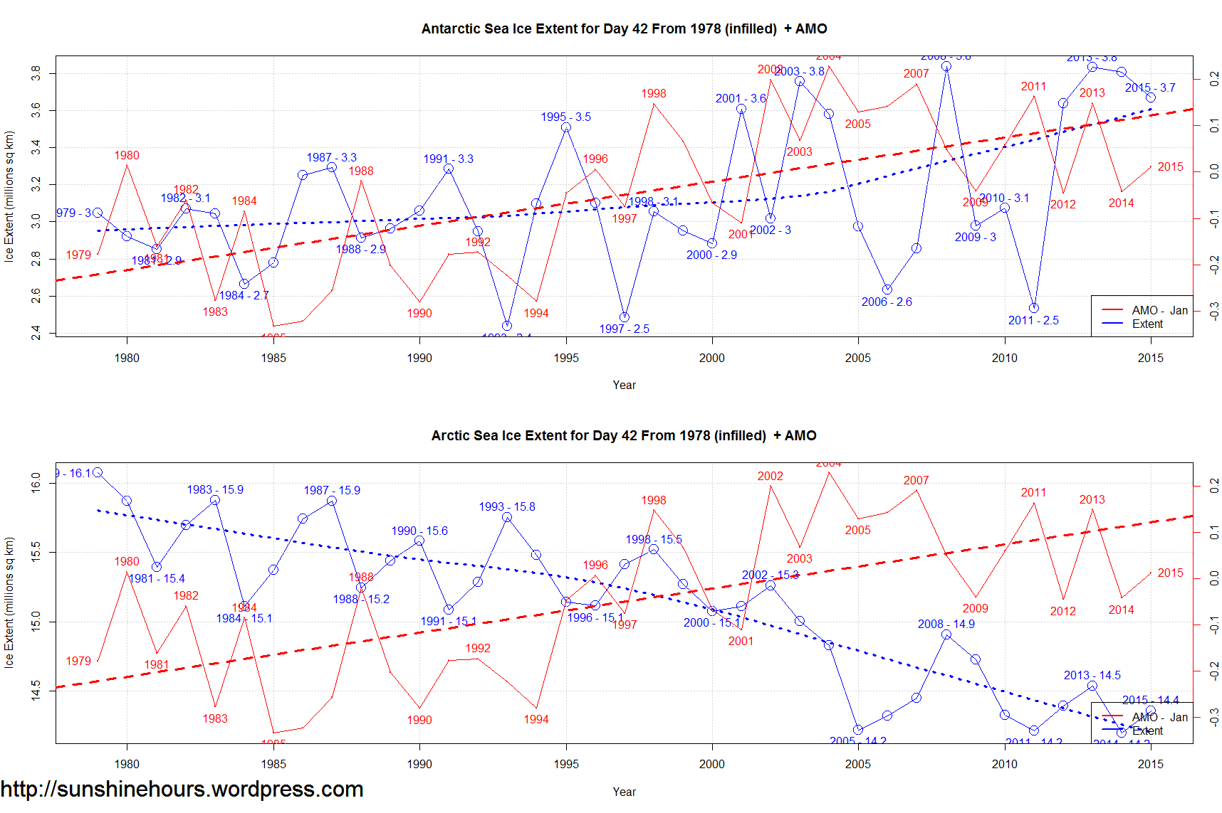
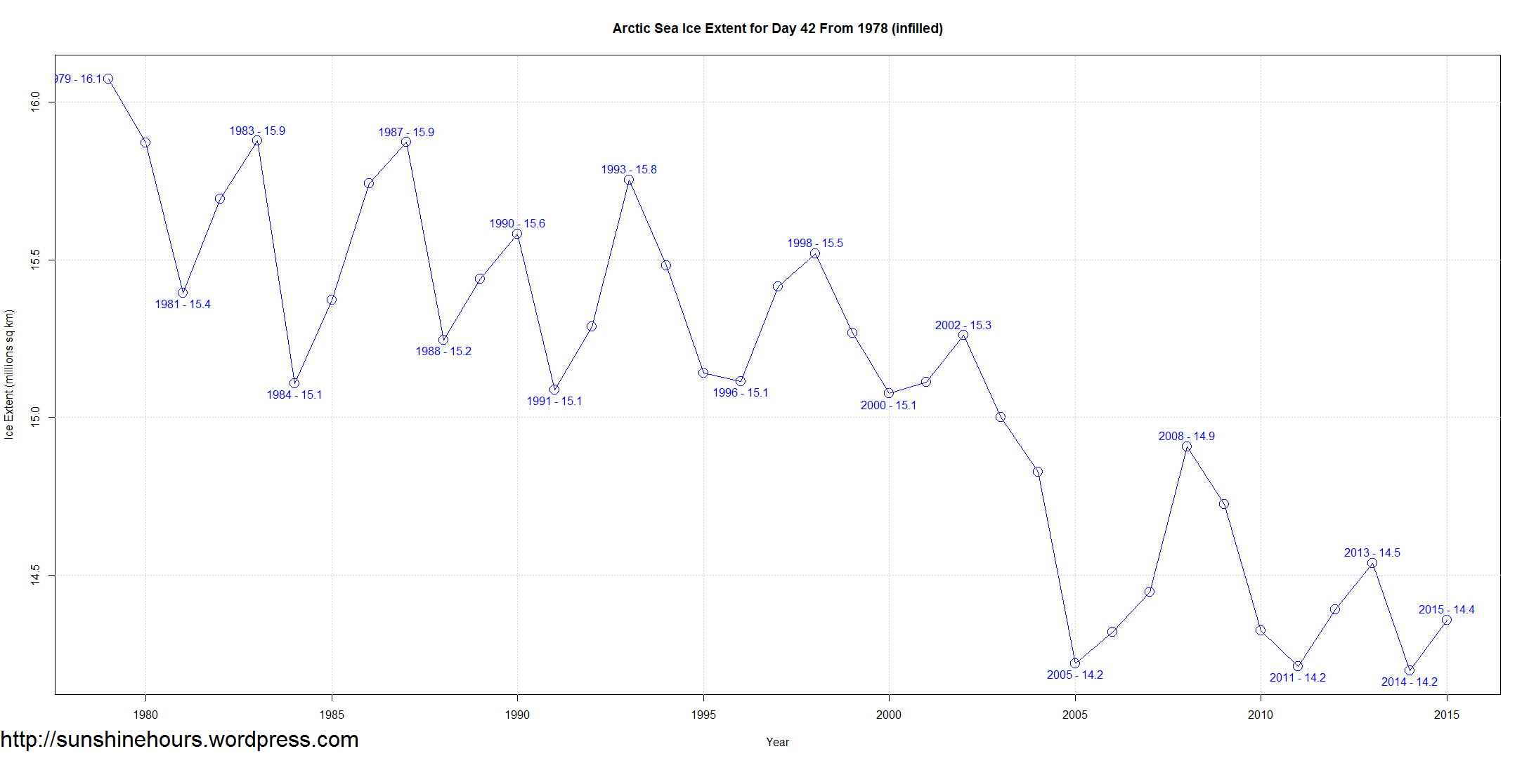
Both the Arctic and Antarctic sea ice fluctuated by large amounts every few years around this day.
Not so much the last few years.
The Arctic would go up and down by 700,000 or 800,000 …. and now it is only going up and down by 300,000 and the bottom stays the same at 14.2 million sq km.
The Antarctic would fluctuate by over 1,000,000 sq km . The last 4 years have seen very small changes from year to year.
It could be a portent of stability or just a pause before the process reverses itself.
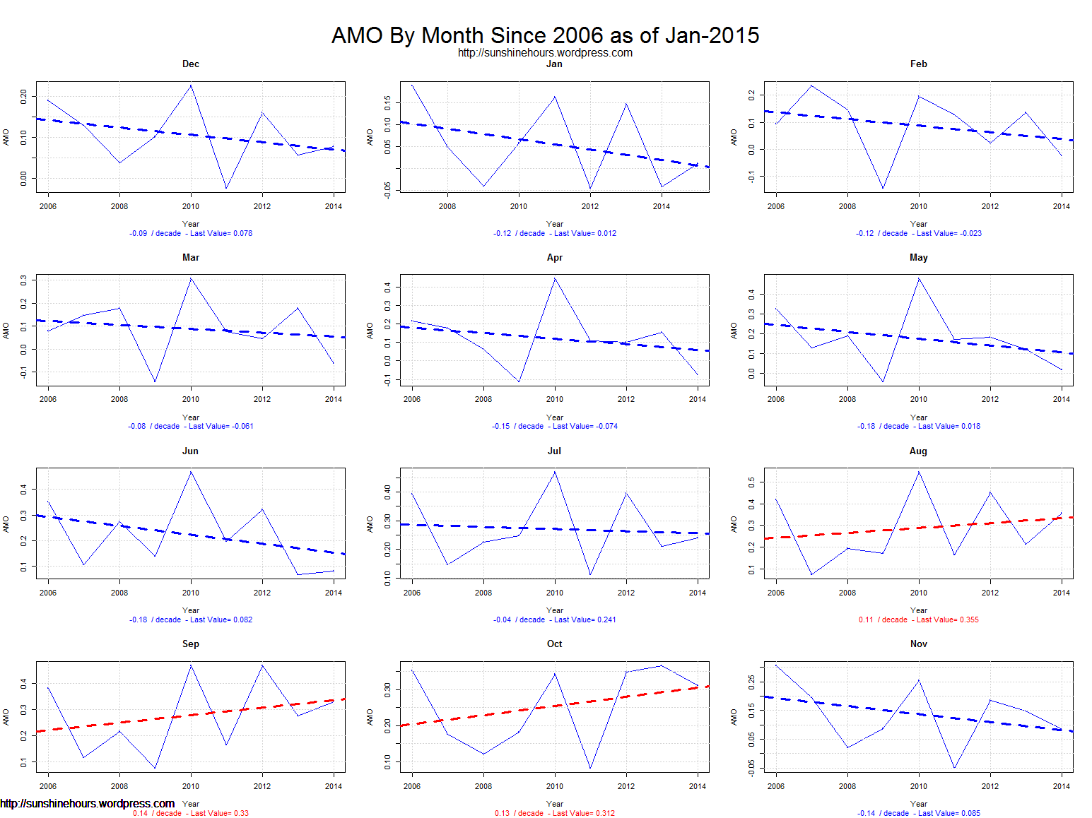
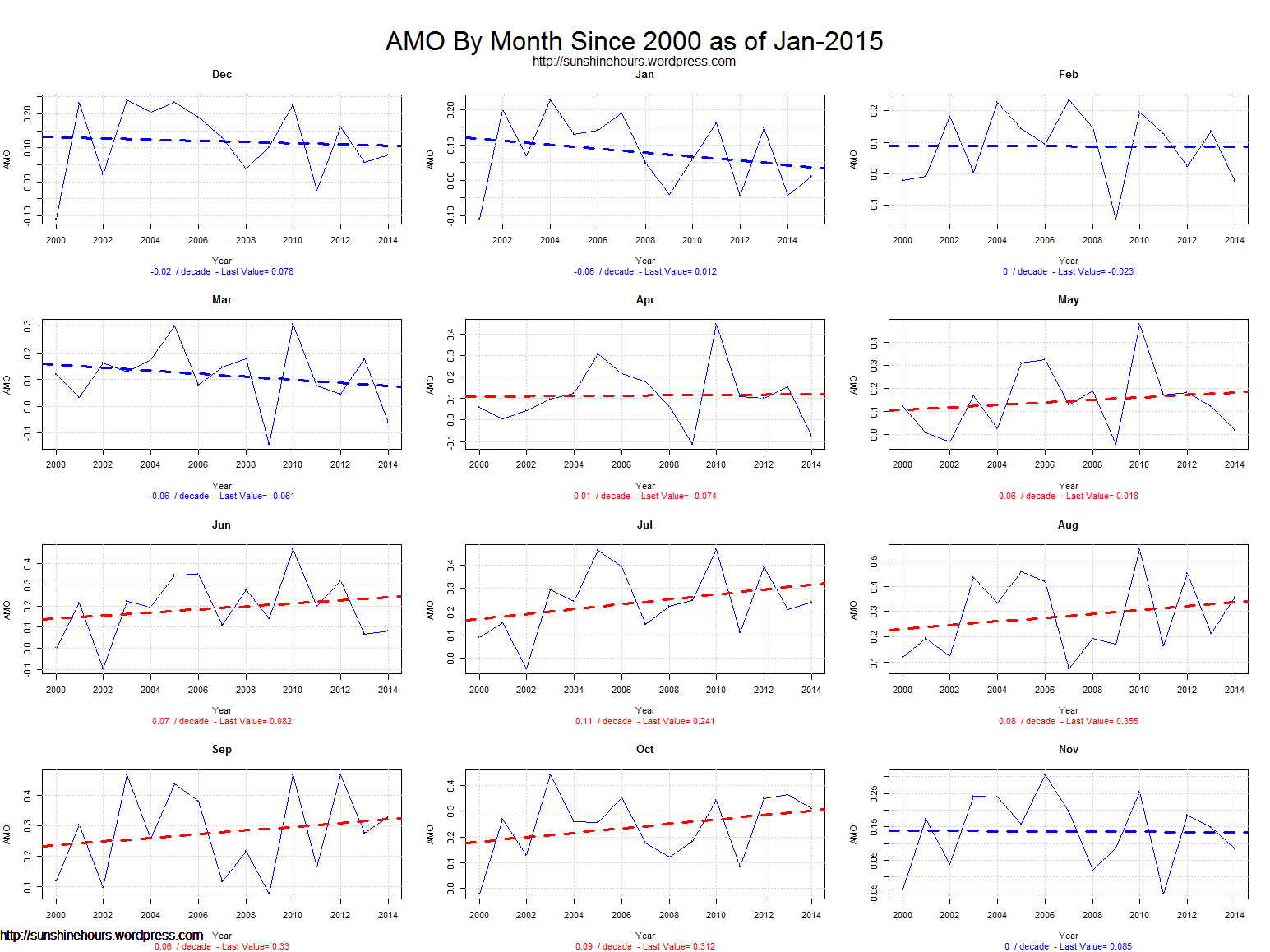
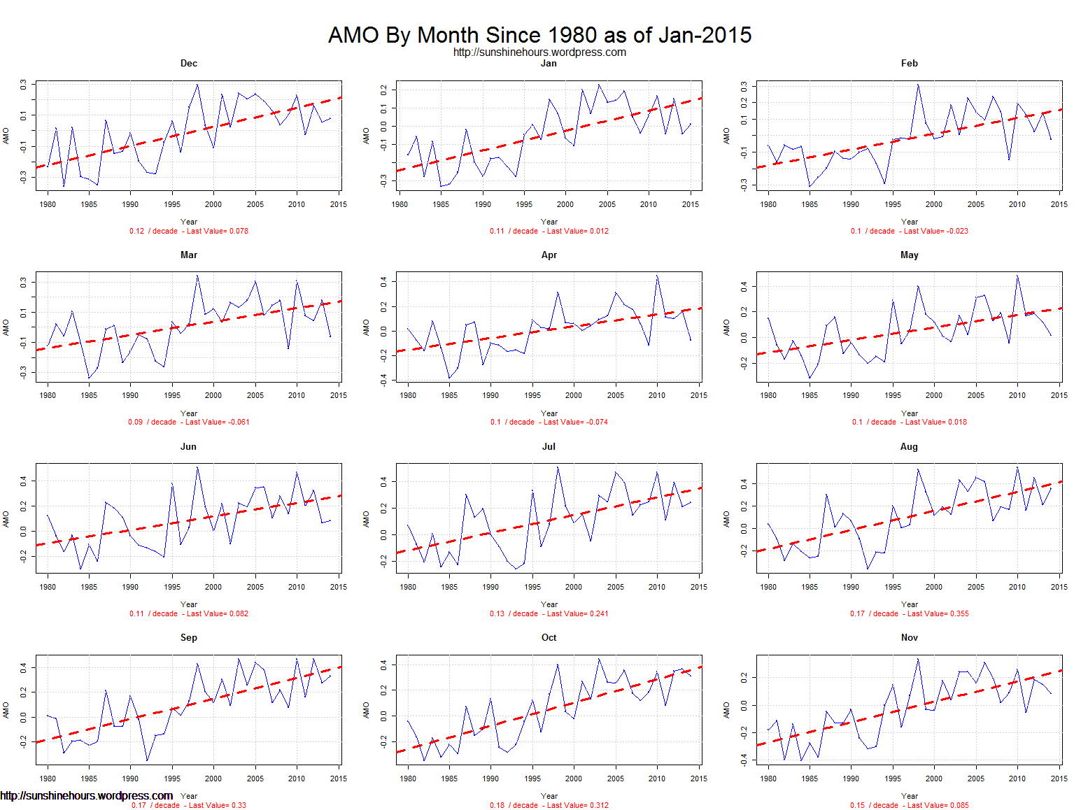
The AMO is getting ready for the big plunge (see bottom graph’s) and is only staying high in just a few months – Aug/Sep/Oct.
It may take decades for the AMO to hit bottom.
And I suspect the Arctic will refreeze and the Antarctic will melt some. And climate “scientists” will claim they predicted it all along.


Very interesting, especially the AMO charts which warrant a bit of study, thanks for the work!
Re the change in the range of fluctuation, could it be down to a change/improvement in method of observation/calculation?
I think it is as a bouncing ball losing energy and the Arctic/Antarctic being mirror images of each other.
I have added an image.
“I think it is as a bouncing ball losing energy…..”
Yeh, get that and the logic behind it. My concern was I recall reading that one of the data sets didn’t actually report the daily level but a moving average, the average of the day plus IIRC the previous 3 days? Just wondered whether it was possible such a regime had been introduced/modified?
Many thanks for the added charts, still mulling over.
Both the AMO and the PDO appear to be in-sync with the long term reduction in Solar output {50 year}, i.e., less Solar less AMO, PDO. As per the Antarctica reduced ice this year, that is due to the increase in Solar output during this Solar cycle. We have just passed the “peak of the Solar cycle”. If I am correct, expect an Antarctica ice rebound, as the short term “increase in Solar output{11 year}” decreases.
We have two cycles on top of each other.